ngx-emoji-mart

DEMO: https://ngx-emoji-mart.vercel.app
This project is a port of emoji-mart by missive.
Installation
npm install @ctrl/ngx-emoji-mart
# Or if you're using yarn
yarn add @ctrl/ngx-emoji-mart
# Or if you're using pnpm
pnpm install @ctrl/ngx-emoji-mart
Dependencies
Latest version available for each version of Angular| @ctrl/ngx-emoji-mart | Angular | | -------------------- | --------- | | 1.0.6 | 8.x | | 3.1.0 | 9.x | | 5.1.2 | 10.x 11.x | | 6.2.0 | 12.x 13.x | | 7.1.0 | 14.x | | 8.2.0 | 15.x | | current | >=16.x |
Components
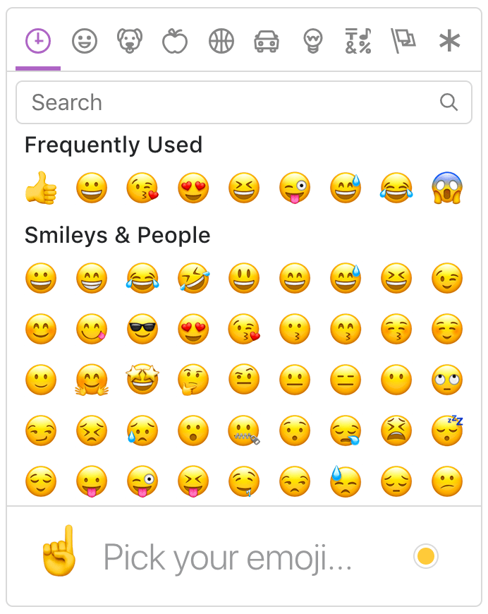
Picker
AddPickerComponent to your module imports:import { PickerComponent } from '@ctrl/ngx-emoji-mart';
@NgModule({
imports: [PickerComponent],
})
export class AppModule {}
// Or if using standalone components
@Component({
standalone: true,
imports: [PickerComponent],
})
export class AppComponent {}Import styles in
styles.scss:@import '@ctrl/ngx-emoji-mart/picker';Or bundle those styles through
angular.json configuration:"build": {
"options": {
"styles": [
"src/styles.scss",
"node_modules/@ctrl/ngx-emoji-mart/picker.css"
]
}
}Now we can use the
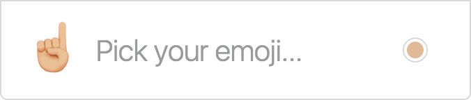
emoji-mart component:<emoji-mart title="Pick your emoji…" emoji="point_up"></emoji-mart>
<emoji-mart set="emojione"></emoji-mart>
<emoji-mart (emojiClick)="addEmoji($event)"></emoji-mart>
<emoji-mart [style]="{ position: 'absolute', bottom: '20px', right: '20px' }"></emoji-mart>
<emoji-mart
[i18n]="{ search: 'Recherche', categories: { search: 'Résultats de recherche', recent: 'Récents' } }"
></emoji-mart>| Prop | Default | Description | | --------------------------- | ------------------------- | ---------------------------------------------------------------------------------------------------------------------------------------------------------------------------------------- | | autoFocus |
false | Auto focus the search input when mounted |
| color | #ae65c5 | The top bar anchors select and hover color |
| emoji | department_store | emoji shown when no emojis are hovered, set to an empty string to show nothing |
| darkMode | varies | Dark mode (boolean). true by default if the browser reports prefers-color-scheme: dark. |
| include | [] | Only load included categories. Accepts I18n categories keys. Order will be respected, except for the recent category which will always be the first. |
| exclude | [] | Don't load excluded categories. Accepts I18n categories keys. |
| custom | [] | Custom emojis |
| recent | | Pass your own frequently used emojis as array of string IDs |
| emojiSize | 24 | The emoji width and height |
| (emojiClick) | | not triggered on return key in search bar. Params: { emoji, $event } |
| (emojiSelect) | | whenever an emoji is selected. returns { emoji, $event } |
| perLine | 9 | Number of emojis per line. While there’s no minimum or maximum, this will affect the picker’s width. This will set Frequently Used length as well (perLine * totalFrequentLines (4)) |
| totalFrequentLines | 4 | number of lines of frequently used emojis |
| i18n | {…} | An object containing localized strings |
| isNative | false | Renders the native unicode emoji |
| set | apple | The emoji set: 'apple', 'google', 'twitter', 'facebook' |
| sheetSize | 64 | The emoji sheet size: 16, 20, 32, 64 |
| backgroundImageFn | ((set, sheetSize) => …) | A Fn that returns that image sheet to use for emojis. Useful for avoiding a request if you have the sheet locally. |
| imageUrlFn | ((emoji) => string) | A Fn that returns the url used for the given emoji. Useful for fetching your own assets. |
| emojisToShowFilter | ((emoji) => true) | A Fn to choose whether an emoji should be displayed or not |
| showPreview | true | Display preview section |
| enableSearch | true | Display search bar |
| emojiTooltip | false | Show emojis short name when hovering (title) |
| skin | 1 | Default skin color: 1, 2, 3, 4, 5, 6 |
| style | | Inline styles applied to the root element. Useful for positioning |
| title | Emoji Mart™ | The title shown when no emojis are hovered |
| hideObsolete | true | Hides ex: "cop" emoji in favor of female and male emoji |
| notFoundEmoji | sleuth_or_spy | The emoji shown when there are no search results |
| categoriesIcons | see svgs/index.ts | the anchor icons |
| searchIcons | see svgs/index.ts | the search/close icon in the search bar |
| showSingleCategory | | show only one category at a time to increase rendering performance |
| useButton | false | Uses button elements for emoji instead of spans |
| enableFrequentEmojiSort | false | Enables re-sorting of emoji on click |
| virtualize | false | Enables experimental virtualized rendering to render only emoji categories in view |
| virtualizeOffset | 0 | use with virtualize option to add or subtract the amount of pixels used to determine whether or not render the category |I18n
search: 'Search',
emojilist: 'List of emoji',
notfound: 'No Emoji Found',
clear: 'Clear',
categories: {
  search: 'Search Results',
  recent: 'Frequently Used',
  people: 'Smileys & People',
  nature: 'Animals & Nature',
  foods: 'Food & Drink',
  activity: 'Activity',
  places: 'Travel & Places',
  objects: 'Objects',
  symbols: 'Symbols',
  flags: 'Flags',
  custom: 'Custom',
},
skintones: {
  1: 'Default Skin Tone',
  2: 'Light Skin Tone',
  3: 'Medium-Light Skin Tone',
  4: 'Medium Skin Tone',
  5: 'Medium-Dark Skin Tone',
  6: 'Dark Skin Tone',
},
Sheet sizes
Sheets are served from unpkg, a global CDN that serves files published to npm.| Set | sheetSize | Size | | -------- | --------- | ------- | | apple | 16 | 334 KB | | apple | 20 | 459 KB | | apple | 32 | 1.08 MB | | apple | 64 | 2.94 MB | | facebook | 16 | 322 KB | | facebook | 20 | 439 KB | | facebook | 32 | 1020 KB | | facebook | 64 | 2.5 MB | | google | 16 | 301 KB | | google | 20 | 409 KB | | google | 32 | 907 KB | | google | 64 | 2.17 MB | | twitter | 16 | 288 KB | | twitter | 20 | 389 KB | | twitter | 32 | 839 KB | | twitter | 64 | 1.82 MB |
Examples of emoji object:
{
  id: 'smiley',
  name: 'Smiling Face with Open Mouth',
  colons: ':smiley:',
  text: ':)',
  emoticons: [
    '=)',
    '=-)'
  ],
  skin: null,
  native: '😃'
}

{
  id: 'santa',
  name: 'Father Christmas',
  colons: ':santa::skin-tone-3:',
  text: '',
  emoticons: [],
  skin: 3,
  native: '🎅🏼'
}

{
  id: 'octocat',
  name: 'Octocat',
  colons: ':octocat',
  text: '',
  emoticons: [],
  custom: true,
  imageUrl: 'https://github.githubassets.com/images/icons/emoji/octocat.png'
}
Emoji
AddEmojiComponent to your module or standalone component imports:import { EmojiComponent } from '@ctrl/ngx-emoji-mart/ngx-emoji';<ngx-emoji [emoji]="{ id: 'santa', skin: 3 }" size="16"></ngx-emoji>
<ngx-emoji emoji=":santa::skin-tone-3:" size="16"></ngx-emoji>
<ngx-emoji emoji="santa" set="emojione" size="16"></ngx-emoji>| Prop | Required | Default | Description | | -------------------------------------------- | :------: | ------------------------- | ---------------------------------------------------------------------------------------------------------------- | --- | | emoji | ✓ | | Either a string or an
emoji object |
| size | ✓ | | The emoji width and height. |
| isNative | | false | Renders the native unicode emoji |
| (emojiClick) | | | Params: { emoji, $event } |
| (emojiLeave) | | | Params: { emoji, $event } |
| (emojiOver) | | | Params: { emoji, $event } |
| fallback | | | Params: (emoji, props) => {} |
| set | | apple | The emoji set: 'apple', 'google', 'twitter', 'emojione' |
| sheetSize | | 64 | The emoji sheet size: 16, 20, 32, 64 |
| backgroundImageFn | | ((set, sheetSize) => …) | Fn that returns that image sheet to use for emojis. Useful for avoiding a request if you have the sheet locally. |
| skin | | 1 | Skin color: 1, 2, 3, 4, 5, 6 |
| tooltip | | false | Show emoji short name when hovering (title) | |
| hideObsolete | | false | Hides ex: "cop" emoji in favor of female and male emoji | |
| useButton | | false | Uses button element instead of span | |Unsupported emojis fallback
Certain sets don’t support all emojis (i.e. Facebook doesn't support:shrug:). By default the Emoji component will not render anything so that the emojis’ don’t take space in the picker when not available. When using the standalone Emoji component, you can however render anything you want by providing the fallback props.To have the component render
:shrug: you would need to:emojiFallback = (emoji: any, props: any) => (emoji ? `:${emoji.shortNames[0]}:` : props.emoji);<ngx-emoji set="twitter" emoji="shrug" size="24" [fallback]="emojiFallback"></ngx-emoji>Custom emojis
You can provide custom emojis which will show up in their own category. You can either use a single image as imageUrl or use a spritesheet as shown in the second object.const customEmojis = [
{
name: 'Octocat',
shortNames: ['octocat'],
text: '',
emoticons: [],
keywords: ['github'],
imageUrl: 'https://github.githubassets.com/images/icons/emoji/octocat.png',
},
{
name: 'Test Flag',
shortNames: ['test'],
text: '',
emoticons: [],
keywords: ['test', 'flag'],
spriteUrl: 'https://cdn.jsdelivr.net/npm/emoji-datasource-twitter@14.0.0/img/twitter/sheets-256/64.png',
sheet_x: 1,
sheet_y: 1,
size: 64,
sheetColumns: 61,
sheetRows: 60,
},
];<emoji-mart [custom]="customEmojis"></emoji-mart>Headless search
ThePicker doesn’t have to be mounted for you to take advantage of the advanced search results.import { EmojiSearch } from '@ctrl/ngx-emoji-mart';
class ex {
constructor(private emojiSearch: EmojiSearch) {
this.emojiSearch.search('christmas').map(o => o.native);
// => [🎄, 🎅🏼, 🔔, 🎁, ⛄️, ❄️]
}
}Display emoji as custom element
// $event is from (emojiClick)
const styles = this.emoji.emojiSpriteStyles($event.emoji.sheet, 'twitter'); // pass emoji sheet
const el = document.createElement('div');
Object.assign(el.style, styles); // apply styles to new element
document.body.appendChild(el);
Storage
By default EmojiMart will store user chosen skin and frequently used emojis inlocalStorage.Possible keys are:
| Key | Value | Description | | ---------- | -------------------------------- | --------------------------------------------------------------------------------------------------------------- | | skin |
1, 2, 3, 4, 5, 6 | |
| frequently | { 'astonished': 11, '+1': 22 } | An object where the key is the emoji name and the value is the usage count |
| last | 'astonished' | (Optional) Used by frequently to be sure the latest clicked emoji will always appear in the “Recent” category |Features
Powerful search
Short name, name and keywords
Not only does Emoji Mart return more results than most emoji picker, they’re more accurate and sorted by relevance.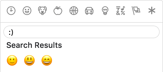
Emoticons
The only emoji picker that returns emojis when searching for emoticons.Fully customizable
Anchors color, title and default emoji

Emojis sizes and length
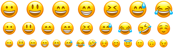
Default skin color
As the developer, you have control over which skin color is used by default.
It can however be overwritten as per user preference.

Multiple sets supported
Apple / Google / Twitter / Facebook
GitHub @scttcper · Twitter @scttcper