Hermes Parallel Coordinates 

A lightweight canvas-based parallel coordinates chart library. Parallel coordinates are a common way of visualizing and analyzing high-dimensional datasets.
Check out the list of Demos to get an idea of the various capabilities and config options.
Or try out the Live Demo in a sandbox.
Screenshots
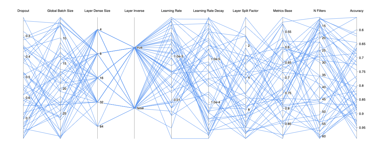
Standard parallel coordinates rendering with default options.
Filtering data on multiple dimensions. You can have multiple filters per dimension as well.
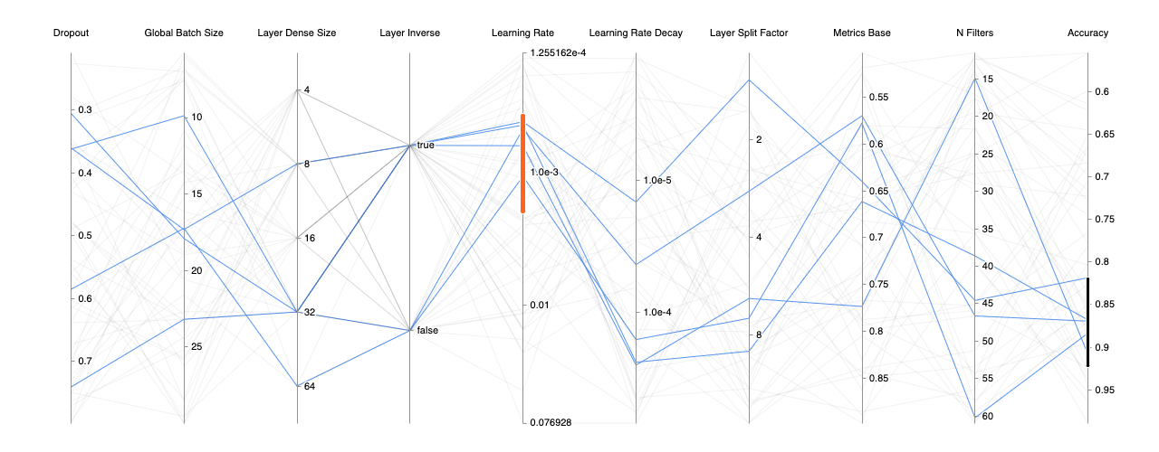
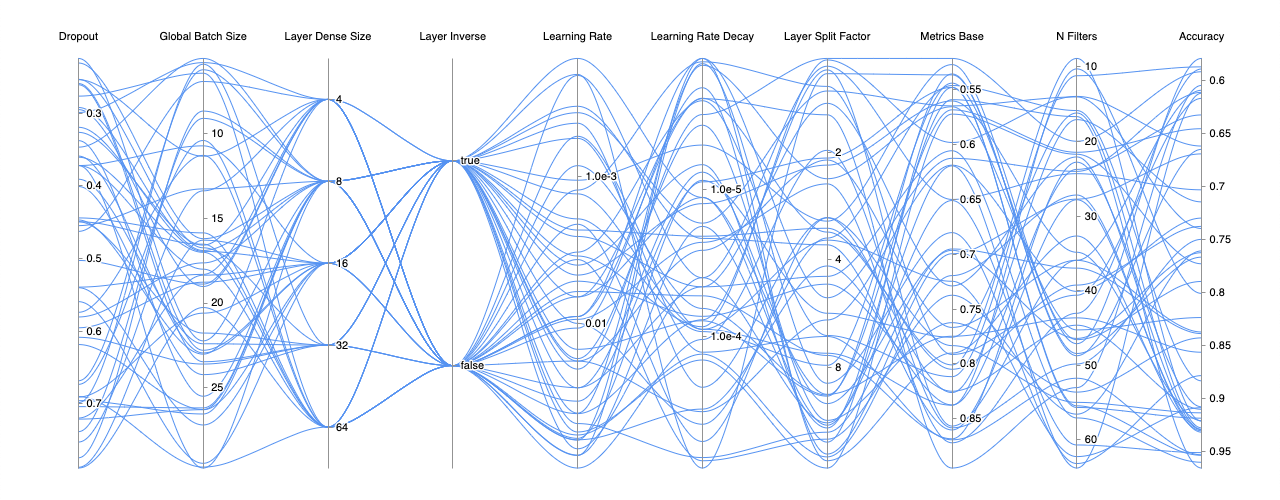
Chart drawn with bezier curves instead of the default straight lines.
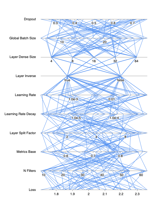
Support for vertical layout with a simple config change of layout from
horizontal to vertical.
Features
- Drag-and-drop dimensions.
- Support for dimension filters. Multiple filters per dimension supported.
- Support for linear, logarithmic and categorical dimension scales.
- Support for vertical layout.
- Auto redraw upon chart resize.
- Color scale and gradient based on a key dimension.
- Highly customizable styles:
- Fast render times.
API
Hermes is a class. To use render the chart, simply create a new instance of Hermes and pass in the necessary parameters.new Hermes(
target: HTMLElement | string,
dimensions?: Hermes.Dimension[],
config?: RecursivePartial<Hermes.Config>,
data?: Hermes.Data,
);Hermes Container
Thecontainer can be an HTML element passed in directly or a query selector that matches an element. For example you can pass in #hermes and Hermes will look for the element with the id attribute set to hermes and use that as a container for the chart rendering.Hermes Data Format
The data format is of type Hermes.Data, which is an object with the dimension unique keys as the object key and a list of values for that dimension as the value. The expected data is defined as:type Data = Record<DimensionKey, Primitive[]>;A sample data input might look like...
const data = {
  'weight': [ 155, 29, 6, 109 ],
  'gender': [ 'm', 'm', 'u', 'f' ],
  'is-adult': [ true, false, false, true ],
};
Hermes Target
Thetarget can be an HTML element passed in directly or a query selector that matches an element. For example you can pass in #hermes and Hermes will look for the element with the id attribute set to hermes and use that as a container for the chart rendering.Hermes Dimension
The dimensions definition is a list of Hermes.Dimension. A sample dimension definition might look like...const dimensions = [
{
key: 'weight',
label: 'Weight',
type: Hermes.DimensionType.Linear,
},
{
categories: [ 'f', 'm', 'u' ],
key: 'gender',
label: 'Gender',
type: Hermes.DimensionType.Categorical,
},
{
categories: [ true, false ],
key: 'is-adult',
label: 'Is an adult?',
type: Hermes.DimensionType.Categorical,
},
];Hermes Data Format
The data format is of type Hermes.Data, which is an object with the dimension unique keys as the object key and a list of values for that dimension as the value. The expected data is defined as:type Data = Record<DimensionKey, Primitive[]>;A sample data input might look like...
const data = {
  'weight': [ 155, 29, 6, 109 ],
  'gender': [ 'm', 'm', 'u', 'f' ],
  'is-adult': [ true, false, false, true ],
};
key: string
This is a required unique identifier for the defined dimension. This is used internally for dimension ordering and when filters are created for a corresponding dimension.label: string
The string label to display on the chart for the dimension.type: 'categorical' | 'linear' | 'logarithmic'
This field specifies the dimension scale type. The 3 possible values arecategorical, linear or logarithmic. The corresponding TypeScript references are Hermes.DimensionType.Categorical, Hermes.DimensionType.Linear and Hermes.DimensionType.Logarithmic.categories: Primitive (optional)
If the dimension scale type is set tocategorical, this field needs to be defined. The data for categorical dimensions need to match a value in the categories list. Some examples of categories:# boolean categories
categories: [ true, false ]
# numeric categories
categories: [ 1, 2, 4, 8, 16 ]
# string categories
categories: [ 'slow', 'medium', 'fast' ]dataOnEdge: boolean (optional)
If unspecified,dataOnEdge defaults to true. When true, the dimension scale ranges from the minimum data value to the maximum data value. For example, if for dimension loss had data values ranging from 2.1 to 5.4, the dimension scale will show 2.1 to 5.4.If disabled and set to
false, Hermes will try to find the nearest nice number for the extremes on the scale. The extremes are still based on the data value range. So for the same loss example above, the dimension scale will instead show 2.0 to 5.5 or something similar.logBase: whole number (optional)
If the dimension scale type is set tologarithmic, logBase can be set to determine what logarithmic base you wish the scale to be set. If this value is not provided, it defaults to logBase of 10. Common log base values are 2 and 10.reverse: boolean (optional)
The dimension axes are drawn vertically, the axis tick values increase from the bottom up. When drawn horizontally, the axis tick values increase from left to right. Setting thereverse to true will reverse the direction of the axis tick along the axes.Hermes Config and Styles
The config provides control over the chart behavior, rendering, style and the ability to hook into key events. Hermes.Config provides a more up-to-date definition of the config.General Config
direction: 'horizontal' default | 'vertical'
The direction the dimensions should be laid out. The direction can be set tohorizontal or vertical. The horizontal direction will draw the dimensions across the canvas with vertical axes. The vertical direction will draw the dimensions top to bottom on the canvas with horizontal axes.Hooks
onDimensionMove: (dimension: Dimension, newIndex: number, oldIndex: number) => void
Optional hook for when the order of dimensions changes via drag and drop. The callback is called during the drag and whenever dimensions required a swap, even before when the mouse is released. The data for the dimension that is dragged, the new index and the original index are returned.onFilterChange: (filters: Filters) => void
Optional hook for when any filter changes. The callback is specifically called on themouseup event. The entire updated filters object is returned.onFilterCreate: (filters: Filters) => void
Optional hook for when a filter is created. The newly create filter is returned.onFilterMove: (filters: Filters) => void
Optional hook for when a filter is moved. The modified filter is returned.onFilterRemove: (filters: Filters) => void
Optional hook for when a filter is removed via single click. Info for the removed filter is returned.onFilterResize: (filters: Filters) => void
Optional hook for when a filter is resized. The modified filter is returned.onReset: () => void
Optional hook for when the chart is reset via double click. The dimension order is reset back to the original order and the filters are cleared out.onResize: (newSize: Size, oldSize: Size) => void
Optional hook for when the chart containing element is resized. The resize is detected using the ResizeObserver API, which observes the chart containing HTML element. When the element changes in size, this callback returns the new size and the original size.Interactions
throttleDelayMouseMove (default 50)
The time interval in millisconds in which the mouse move event is allowed to propogate. For example, with the default 50ms, as the user moves the mouse cursor around, the mouse move event, the associated calculations and the rerenders are allowed to happen only every 50ms. Themouseup handler performs all of the mousemove event operations. So if this interval happens to be set to a very high number, where the mouseup event occurs before a throttle throttleDelayResize (default: 50)
The time interval in milliseconds in which the resize event is allowed to propagate. For example, with the default 50ms, as the user is changing the browser window that contains the chart, the resize event, the associated calculations and the rerenders are allowed to happen only every 50ms.Style Options
axes
Theaxes style options allows the dimension axes to be customized visually.axis: AxisOptions
Theaxis style impacts how each dimension axis is drawn and what the interactive area of the axis will be.axis: {
// Adds a 15px to both the left and right (or above and below depending on the chart orientation) of the 1px wide axis for interactive area.
boundaryPadding: 15,
// Draws the +Infinity and -Infinity axis offset as a 2, 4 dashed lines.
infLineDash: [ 2, 4 ],
// Draws the +Infinity and -Infinity axis ticks 24px off from the axis ends.
infOffset: 24.0,
// Draws the axis as a 1px width line.
lineWidth: 1,
// Sets the NaN tick 24px off of the axis at the end.
nanGap: 24.0,
// Draws the axis with an opaque grey.
strokeStyle: 'rgba(147, 147, 147, 1.0)',
},axisActve: StyleLine
TheaxisActive style is in effect when the user is clicking on the axis to create or modify dimension filters.axisActive: {
lineWidth: 3,
strokeStyle: 'rgba(99, 200, 255, 1.0)',
},axisHover: StyleLine
TheaxisHover style is in effect when the user hovers over the axis with the mouse pointer.axisHover: {
lineWidth: 3,
strokeStyle: 'rgba(79, 180, 246, 1.0)',
},filter: FilterOptions
Thefilter style determines how the filters are drawn.filter: {
cornerRadius: 2,
fillStyle: 'rgba(235, 100, 200, 1.0)',
strokeStyle: 'rgba(255, 255, 255, 1.0)',
width: 4,
},filterActive: FilterOptions
ThefilterActive style is in effect when the user clicks on the filter to interact with the filter.filterActive: {
cornerRadius: 3,
fillStyle: 'rgba(255, 120, 220, 1.0)',
width: 8,
},filterAxisHover: FilterOptions
ThefilterAxisHover style is applied to filters on the axis the user is hovering over, but not directly hovering over the filters themselves.filterAxisHover: {
cornerRadius: 2,
fillStyle: 'rgba(235, 100, 200, 1.0)',
width: 6,
},filterHover: FilterOptions
ThefilterHover style is in effect when the user is hovering over the filter.filterHover: {
cornerRadius: 2,
fillStyle: 'rgba(235, 100, 200, 1.0)',
width: 8,
},label: LabelOptions
Thelabel style determines how the tick labels ared drawn for the axis.label: {
fillStyle: 'rgba(0, 0, 0, 1.0)',
font: 'normal 11px sans-serif',
lineWidth: 3,
offset: 4,
placement: ELabelPlacement.After,
strokeStyle: 'rgba(255, 255, 255, 1.0)',
},labelActive: StyleText
ThelabelActive style is in effect for the tick labels when axis is clicked on by the user.labelActive: { fillStyle: 'rgba(0, 0, 0, 1.0)' },labelHover: StyleText
ThelabelHover style is in effect the tick labels when the user hovers over the axis.labelHover: { fillStyle: 'rgba(0, 0, 0, 1.0)' },tick: TickOptions
Thetick style determines how the tick marks on the axis are drawn.tick: {
length: 4,
lineWidth: 1,
strokeStyle: 'rgba(147, 147, 147, 1.0)',
},tickActive: StyleLine
ThetickActive style determines how the tick marks on the axis are drawn when the axis is active.tickActive: { strokeStyle: 'rgba(99, 200, 255, 1.0)' },tickHover: StyleLine
ThetickHover style determines how the tick marks on the axis are drawn when the user hovers over the axis.tickHover: { strokeStyle: 'rgba(79, 180, 246, 1.0)' },data
Thedata style options allows for the chart series line to be styled. The most common line styles to change include the line color and the width of the line. This is represented by an object of StyleLine.default: StyleLine
Thedefault style is used to draw all the chart lines. This is useful to provide a uniform style for all chart series. For example, the following default style would draw all the series with a thickness of 1px wide and with an opaque light blue color.default: {
lineWidth: 1,
strokeStyle: 'rgba(82, 144, 244, 1.0)',
},filtered: StyleLine
Thefiltered style is used to render lines NOT included in the chart filters. So typically a faint transparent color is better to use for this style, to bring focus to the highlighted series.filtered: {
lineWidth: 1,
strokeStyle: 'rgba(0, 0, 0, 0.05)',
},overrideNaN: StyleLine (optional)
TheoverrideNaN style is in effect when a series has a NaN value.overrideNaN: {
lineWidth: 1,
strokeStyle: 'rgba(255, 0, 0, 0.2)',
},overrideNegativeInfinity: StyleLine (optional)
TheoverrideNegativeInfinity style is in effect when a series has a -Infinity value.overrideNegativeInfinity: {
lineWidth: 1,
strokeStyle: 'rgba(255, 0, 0, 0.2)',
},overridePositiveInfinity: StyleLine (optional)
TheoverridePositiveInfinity style is in effect when a series has a +Infinity value.overridePositiveInfinity: {
lineWidth: 1,
strokeStyle: 'rgba(255, 0, 0, 0.2)',
},path: PathOptions
Thepath option provides control over how to render the series. Typically the PathType.Straight is used to be able to pack more dimensions into the chart, but for large charts, PathType.Bezier can be much more pleasing to visualize, which will render smooth and curving bezier curves.path: {
options: {},
type: EPathType.Straight,
},series: StyleLine (optional)
Theseries is a list of styles that is used to provide finer control of how to draw each individual chart series. Each index of the series style maps to the series index in the data.series: [
// Series 0 will be red.
{ lineWidth: 1, strokeStyle: 'rgba(255, 0, 0, 1.0)' },
// Series 1 will be green.
{ lineWidth: 1, strokeStyle: 'rgba(0, 255, 0, 1.0)' },
// Series 2 will be blue.
{ lineWidth: 1, strokeStyle: 'rgba(0, 0, 255, 1.0)' },
],targetColorScale: string (optional)
ThetargetColorScale is a list of colors (minimum of two) that determines the gradient that is used to draw the chart series, based on the target dimension (targetDimensionKey).targetDimensionKey: DimensionKey (optional)
ThetargetDimensionKey is used in conjunction with targetColorScale. This tells the chart which dimension to use to determine the color of the series based on that dimension value along the color scale range.dimension
Thedimension options focus on the layout and styles of the dimensions as a collective. For modifying the axis portion of the dimensions, look at the axes options.label: LabelMoveOptions
Thelabel options control where to draw the dimension labels relative to the dimension axes.label: {
angle: undefined,
boundaryPadding: 5,
fillStyle: 'rgba(0, 0, 0, 1.0)',
font: 'normal 11px sans-serif',
lineWidth: 3,
offset: 16,
placement: ELabelPlacement.Before,
strokeStyle: 'rgba(255, 255, 255, 1.0)',
},labelActive: StyleText
ThelabelActive style is in effect when the user clicks on the dimension label to interative with the dimension.labelActive: { fillStyle: 'rgba(99, 200, 255, 1.0)' },labelHover: StyleText
ThelabelHover style is in effect when the user hovers over the dimension label.labelHover: { fillStyle: 'rgba(79, 180, 246, 1.0)' },layout: DimensionLayout
Thelayout option controls how the dimensions are spaced out.DimensionLayout.AxisEvenlySpaced draws the dimension axes even distances from each other. The dimension labels do not impact the layout.DimensionLayout.Equidistant draws the dimensions equidistant from each other. The overall width of the dimension counts towards calculations so dimension label and tick labels can impact the spacing.padding: number | number, number | number, number, number, number
Thepadding between the edge of the chart container and the chart content, such as the labels, axes and axis labels. The padding can be a single number, a list of two numbers or a list of 4 numbers.// 8px on all four sides ([ 8, 8, 8, 8 ]).
padding: 8
// Padding of 16px on top and bottom and 8px on the left and right ([ 16, 8, 16, 8 ]).
padding: [ 16, 8 ]
// padding of 32px on top, 16px on the right, 8px on bottom, and 4px on the left.
padding: [ 32, 16, 8, 4 ]Special Thanks
- Leon Sorokin's uPlot was a great source of inspiration and a lot of the setup work and deployment steps of Hermes are modeled after it. Leon has also provided some great guidance on some technical improvements.
- Alex Johnson provided some great feedback during development to improve the overall the user experience of Hermes.