react-native-flip-toggle-button

A cross-platform customisable toggle button built upon react-native's TouchableOpacity and Animated APIs.
Why flip toggle?
Well, this toggle button provides a label centered within the button which flips as per the toggle's on / off state.
You have seen it on old iOS homescreen (swipe to unlock). react-native-flip-toggle-button uses Animated APIs useNativeDriver flag to offload animations from the JS thread and thus provide more responsive and seamless toggle transition even when the JS thread is busy.
Contents
Instructions
- Run
yarn add react-native-flip-toggle-button or npm i react-native-flip-toggle-button --save. - Add
import FlipToggle from 'react-native-flip-toggle-button' in your react-native application's source code.
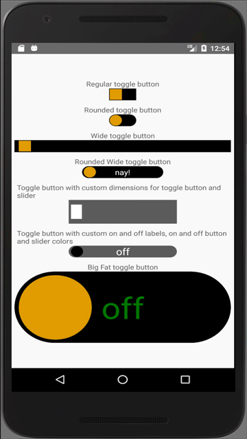
Demo
Getting Started
import the FlipToggle component into your app's js file.
Then, use the FlipToggle component as shown below
<FlipToggle
  value={this.state.isActive}
  buttonWidth={100}
  buttonHeight={50}
  buttonRadius={50}
  sliderWidth={20}
  sliderHeight={10}
  sliderRadius={50}
  onLabel={'On'}
  offLabel={'Off'}
  labelStyle={{ color: 'black' }}
  onToggle={(newState) => console.log(`toggle is ${this.state.isActive ? `on` : `off`}`)}
  onToggleLongPress={() => console.log('toggle long pressed!')}
/>
API
|prop|propType|required|default|description|
|----|:------:|:------:|:-----:|-----------|
|value|boolean|yes|n/a|default state of the flip toggle button|
|buttonWidth|number|yes|n/a|Width of the flip toggle button|
|buttonHeight|number|yes|n/a|Height of the flip toggle button|
|onToggle|function|yes|n/a|function that will be executed after toggle state is changed, returns the new state of the toggle|
|onToggleLongPress|function|no|no|function that will be executed after toggle button is long pressed, returns the new state of the toggle|
|changeToggleStateOnLongPress|boolean|no|true|flag to set whether state of the toggle button should be updated on long press|
|disabled|boolean|no|false|flag to disable the toggling of the flip toggle button|
|buttonRadius|number (0 - 100)|no|0|border radius of the flip toggle button, expressed in terms of % of buttonWidth|
|sliderWidth|number|no|90 % of buttonHeight|Width of the slider|
|sliderHeight|number|no|90 % of buttonHeight|Height of the slider|
|sliderRadius|number (0 - 100)|no|0(will use the buttonRadius as default if it is set)|border radius of the flip toggle button, expressed in terms of % of buttonWidth|
|onLabel|string|no|null|Text to be displayed within the button when it is on|
|offLabel|string|no|null|Text to be displayed within the button when it is off|
|labelStyle|object|no|{ color: 'white', fontSize: '16' }|Style object for the text displayed within the flip toggle button|
|margin|number|no|2 % of the buttonWidth|margin / spacing between the flip toggle button and the slider|
|buttonOnColor|'string'|no|'#000'|background color of the flip toggle button when it is on|
|buttonOffColor|'string'|no|'#000'|background color of the flip toggle button when it is off|
|disabledButtonOnColor|'string'|no|'#666'|background color of the flip toggle button when the toggling is disabled but set at on|
|disabledButtonOffColor|'string'|no|'#666'|background color of the flip toggle button when the toggling is disabled but set at off|
|sliderOnColor|'string'|no|'#dba628'|background color of the slider when it is on|
|sliderOffColor|'string'|no|'#dba628'|background color of the slider when it is off|
|disabledSliderOnColor|'string'|no|'#444'|background color of the slider when the toggling is disabled but set at on|
|disabledSliderOffColor|'string'|no|'#444'|background color of the slider when the toggling is disabled but set at off|
Issues
If you face any issues with implementing this component or have a feature request or queries, please create a new
issue.
Contribute
Improve this project and help the community by creating PRs.
PRs will be reviewed once every week, and will only be merged if they add to the project's value.
A proper description and necessary steps to reproduce the issue are mandatory for any issue to be considered.