octagon


description
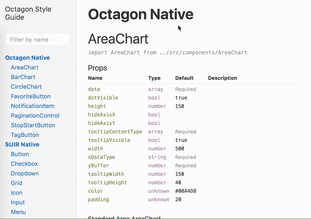
octagon is a react component library. it is built on top of Semantic UI React (SUIR). You can see examples of the components and tinker with the API via our interactive library documentation.this package provides:
- a custom semantic-ui theme
- a set of supplementary react components beyond those provided by SUIR
note: if you are looking for a ground up framework, please instead jump directly to semantic-ui-react, as this project is generally just an opionionated implementation of the SUI ecosystem.
installation
to install and use this project within your project, simply clone the react-octagon project and use yarn to install it.yarn add react-octagon or yarn add --dev react-octagonusage
using octagon components in your app is easy:- import octagon's CSS
- import components from the lib, or from SUIR
import 'react-octagon/lib/styles/semantic.css'
import { FavoriteButton } from 'react-octagon'
import { Segment } from 'semantic-ui-react'

class MyWigdet () {
  render () {
    return (
      <Segment>
        <FavoriteButton isFavorited />
      </Segment>
    )
  }
}
you can interact with octagon components on our interactive styleguide. you can also launch this locally, which will be especially valuable if you want to develop new components. built on Styleguidist.
react component api distribution
useful if you'veyarn linked your front-end project with octagon and want to iterate on components without suffering the build/publish lifecycle for octagon. you must run yarn build to get a fresh set of react components!